Project description:
Build a prototype website for an event for new students in Copenhagen
Subject:
Music Festival Copenhagen
Goal:
Gather new students, Host a great event, make it as sustainable as possible
Group members: Emil Gray Thomsen, Maria Breum, Katrine Rasmussen, Alberthe Haurholm & Amalie Bendixen
Intro
We decided to organize a one-day music festival for both new and returning students at Cphbusiness. The goal is to create a social event that will strengthen the sense of community among students at Cphbusiness. Therefore, the event will be open to everyone who purchases a ticket. However, Cphbusiness students will be granted free admission upon presenting a valid student ID when purchasing their ticket. For others, the ticket price will be 400 DKK.
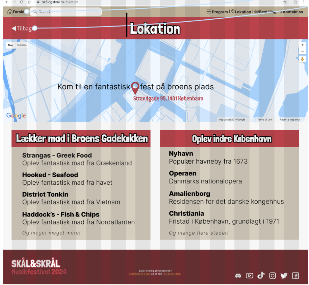
The event will feature performances by four Danish artists, with shows scheduled at 19:00, 20:00, 21:00, and 22:00. The festival will be held in collaboration with Broens Gadekoekken, an outdoor mini street food market located at Strandgade 95, 1401 Copenhagen. In addition to enjoying live music, students will have the opportunity to savor a delicious dinner and a variety of refreshing beverages together.
The event is free for Cphbusiness students, with the goal of attracting as many students as possible to the event, in hopes of turning the objective of a stronger community into a reality.
Logo
We created our logo, using AI, in the design app Canva. We wanted to create a fitting logo for the event. We ended up with some different deign ideas, but ultimately ended with a singing cat, holding a microphone in one paw and a beer in the other
Breakdown Structures
Since we learned about breakdown structures after we had already started our project, we had not created any of them initially. We did not consider it necessary to develop a PBS (Project Breakdown Structure) or a WBS (Work Breakdown Structure), as we were not actually required to produce the product, but only to outline and prototype it.
However, we chose to create an OBS (Objective Breakdown Structure), as it is always relevant to keep the project’s goals in mind when designing something that, even if only hypothetically, would have users;
Goal 1: Gather new students.
- Criterias of success 1: Sell tickets & spreading the word.
Goal 2: Make an awesome event.
- Criterias of success 2: Get relevant musical artists.
Goal 3: Make even sustainable.
- Criterias of success 3: Get the right permits & as sustainable as possible.
Principles of design
We decided to design our website using the principles of the C.R.A.P - model;
C: Contrast
By having contrasts on the different elements of our website, we ensure a user-friendly platform that is easy to navigate through. With the calm color of white that helps to organize thoughts as well as the basic of the beige color, creates a simple, non-threatening vibe. he color of beige is connected to nature and earth, and is also now a symbol of sustainability. It creates the casual, approachable and comfort that we were looking for in our user-friendly website.
The pops of red, dominates the calming colors and is very difficult to miss. It attracts the viewers attention as it is a “loud” communicative color. Red symbolizes warmth, love and joy - which is also what we wanted to represent the overall essence of our event.
The red and beige also ties in with our logo and thereby strengthens the visual context.
R: Repetition
By repeating the visual element of color, fonts and forms, we wanted to create the illusion of context and familiarity. By repeating the elements of design, we wanted to enforce the identity of the website in order to make the navigation more user-friendly.
A: Alignment
We selected a 12-column grid layout for the website design to strategically combine element sizes. This approach ensures an organized, clean layout that prioritizes user-friendliness while maintaining a visually appealing aesthetic throughout.
P: Proximity
We have positioned related elements in close proximity to each other and used the same color to visually indicate their connection. Additionally, we have incorporated a hierarchical structure, making it easy to distinguish between main categories and subcategories. Beyond enhancing the understanding of the relationships between elements, this proximity also contributes to visual balance and an aesthetic harmony on the page.
Colors
We have chosen to incorporate colors from the warm color-spectrum as the primary visual elements in our design, specifically two shades of red: one light and one dark. Red, symbolizing warmth, joy, and love, was regarded as the ideal color to represent the essence of our event. Additionally, we have selected beige as a third primary color, both for aesthetic reasons and for its harmonious interaction with red. Beige also serves as a central color in our logo, reinforcing the visual coherence of our branding.
Primary Colors:
- Light red
- Dark red
- Beige
Secondary Colors
- Black
- White
Construction and folds:
We have chosen to feature an attention-grabbing and engaging element above the fold on our homepage. This means we have designed the front page to visually convey the product we are promoting, with the goal of evoking the positive atmosphere of the festival. The idea is to spark the visitor’s interest and encourage them to purchase a ticket. The event is clearly presented with its name, location, and date, ensuring there is no doubt about what is happening and when. Additionally, a prominent "Call to Action!" is displayed, motivating users to buy tickets for our event.
Below the fold, we provide all the essential details. Here, users can read about the event program, find additional information about the location, purchase various tickets, and learn more about the event and its partners.
We have made this design choice to create a visually clean and aesthetically pleasing website, while still ensuring that user interest is captured without requiring much effort to find the necessary information. All critical details are conveniently placed just below the fold, with only a small scroll needed to access them.
Sitemap
When we brainstormed ideas for this website, we quickly reached a consensus on its fundamental structure. Naturally, we decided to begin with a homepage, from which users could navigate to four additional pages:
- Program: The subpages under the Program section, which present each individual artist participating in the festival, are designed as a stack of pages stacked on top of each other.
- Location
- Tickets
- Contact us
We then created a relatively simple sitemap to gain an overview of our information hierarchy.
Once the sitemap was finalized, we proceeded with developing the website, creating a much more detailed prototype.
In the final version of our sitemap, we added a new page titled "About Us." Under this, we introduced the subpage "Protect Nature," which is aligned with the environmental theme outlined in the brief, emphasizing the festival's commitment to sustainability. Additionally, we added subpages under the "Tickets" section, which are visually represented as a stack of pages on the website, showcasing the various ticket types available for purchase for the festival.
Website anatomy
In our design, we have utilized column grids. From the outset, we decided on a fixed grid structure consisting of 12 vertical columns across all pages. From there, we built our website based on these fixed grid structures, which we hope will provide a consistent visual experience and clarity, making it easy for users to navigate the site. By maintaining these consistent grid structures throughout the site, we create a sense of familiarity with each interaction. This is crucial, as we aim to avoid confusing our users and instead provide a sense of order and clarity, all while capturing their attention and encouraging interest in purchasing our product.
Below, we demonstrate how we have applied the 12 vertical column grids in our prototype and design.
Click here for original assignment (in danish)
-
Sourcelist:
- Rold, M. Interfacedesign: Fra idé til digital prototype. 2. udgave. 2024
-
Programs used:
- Figma
- Photoshop
- Canva
- Capcut