Project description:
Choose an artist and, inspired by their past works,
create a virtual universe for a future album release.
Design a title, album cover, and theme for promotion across media platforms
Artist:
The Cure
Goal:
Create a landing page with easy access to products.
Create an interesting and engaging theme for promotion across media platforms
Designed and Constructed by: Maria Breum
Group members: Alberthe Haurholm, Sophie Duroj Bidstrup & Maral Franck Bican
Intro
When we selected The Cure as the artist for this project, we were unaware that they had just announced their first new album in 16 years.
The Cure is an alternative rock band, formed in 1976 in Sussex, England. As such, they are considered an older band. Based on their previous albums, one could argue that they exhibit elements of goth or punk, although the band's frontman denies categorizing them as a punk band. Throughout their career, they have maintained a distinctive and unique aesthetic, both in terms of album designs and the personal style of the frontman. His iconic look, which features black clothing, wild hair, dark eyeliner, eyeshadow, and red lipstick, has been a constant throughout his career, and he continues to embrace this look at the age of 65.
Upon selecting The Cure and discovering that they were releasing their first album in 16 years, we decided to take advantage of this opportunity to create our fictional version of their "comeback" album.
What is particularly interesting about their new album is that it represents a significant departure from their previous style. The album introduces a simplicity that has never been seen in their career before. It features a minimalist, sleek, and monochromatic color palette, contrasting sharply with the vibrant and eclectic aesthetics they have previously embraced.
For our project, we have chosen to focus on these clean, mysterious, and minimalist elements, incorporating motifs of stone and water to align with the album's new direction.
Album Design
When we had decided that we were going to make another version of their new album - and we had agreed that we going to also focus on some sort of stone/sculpture as our main design element - we each had to go and generate a lot of different pictures and design ideas.
After about 15 different design ideas, I really liked the water element as a contrast to the stone and thought to do so many different and interesting things with water. We decided to go with the stone/water design, while using the iconic real-life logo of The Cure, making it white instead of black.
The title of our album became "Where the lonely echoes go". This name came about after we wrote down previous album names of The Cure that we liked as well as the name of their actual new album and asked ChatGPT to generate a name that tied together all of the album names.
The Cure's actual album is called: "Songs Of A Lost World"
Breakdown Structures
Since we learned about breakdown structures after we had already started our project, we had not created any of them initially. We did not consider it necessary to develop a PBS (Project Breakdown Structure) or a WBS (Work Breakdown Structure), as we were not actually required to produce the product, but only to outline and prototype it.
However, we chose to create an OBS (Objective Breakdown Structure), as it is always relevant to keep the project’s goals in mind when designing something that, even if only hypothetically, would have users;
Goal 1: Promoting the new album in a mystical yet exciting way - much like they did with their actual new album.
- Criterias of success 1: Getting peoples attention, and making them go to our landing page.
Goal 2: Make a design that matches the Style of The cure, while making the design look classic, timeless and aesthetically pleasing.
- Criterias of success 2: Making the album design, so people would want to buy it and display it.
Goal 3: Creating a cathing title for our album, that matches The Cure as well as a design for their new (real life) singe, Alone, incorporating the same elements for familiarity.
- Criterias of success 3: Give a "taste" of the new single, making people want to stream the song and pre-save the album.
Principles of design
We decided to promote our album using the AIDA - model;
A: Attention
To capture people’s attention, we have incorporated movement, as motion tends to draw the eye.
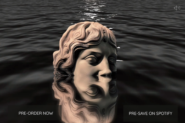
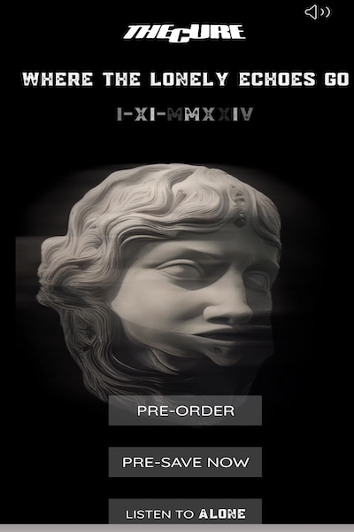
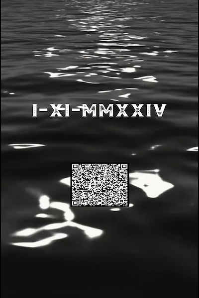
As part of this, we have created banners where the dark water moves. Additionally, we have designed banners with an animation that causes our sculpture head to rotate, while our Roman numerals appear and disappear in a playful manner. These Roman numerals represent the album’s release date.
I: Interest
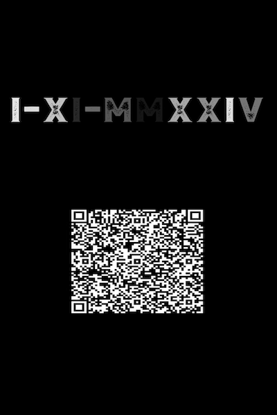
To generate interest, we aimed to make the entire promotion somewhat mysterious. By not always revealing the artist’s name, but instead focusing on movement, the Roman numerals, and a QR code, we sought to create intrigue. This mysterious approach is inspired by the way The Cure has chosen to promote their new album. It is rare to find explicit information; instead, the rotating head of a sculpture is the primary focal point.
The QR code is intended to appeal to a younger audience, who may not be as familiar with The Cure , given that they are an older band and have not released new material in 16 years.
D: Desire
Another way to capture attention - and hopefully spark the desire to explore further - is through sound. In this context, we descided to promote the album across various social media platforms, such as Instagram.
Our sponsored ads that appear on users' feeds should provide a teaser of their new single, “Alone” — something that The Cure is already using in their own album promotion. The goal is to offer a preview that will hopefully encourage listeners to learn more. This teaser would also be available on the landing page users are directed to when they click "pre-save" or scan the QR code from the ads.
Through this approach, we hope to engage those who find the preview intriguing or appealing, prompting them to pre-save the track on platforms like Spotify or other streaming services.
A: Action
The final — and perhaps most challenging — stage of the AIDA-model is Action. We need to encourage people to actively purchase our product.
First and foremost, we want to ensure easy and fast access from point A to point B, meaning from advertisement to product purchase. Given that everything is digital nowadays, it's somewhat unrealistic to expect people to buy physical products like CDs or LPs due to the prevalence of streaming services. For this reason, we've chosen a classic and aesthetically pleasing look for our album.
We hope this will encourage people to buy the LP as a "collector’s item" or as a piece of art they can display in their homes. In this regard, we have also designed a limited edition version of the album.
Due to the rise of digital streaming, we also aim to encourage listeners to stream the band's music. Therefore, we've narrowed down our options to just three key actions that we want customers to take. Our primary goals are to boost the streaming numbers for the single and to generate as many pre-saves for the album as possible.
Streaming - based on Spotify
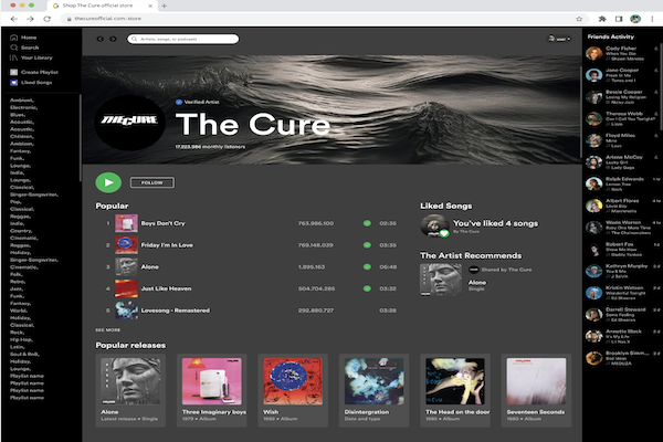
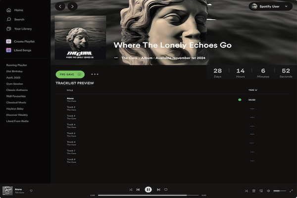
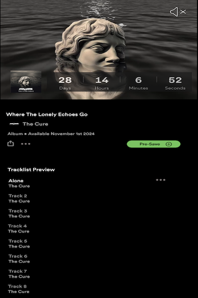
We have created a page where users can "Pre-Save" the album on Spotify, as the album is set to release on November 1, 2024.
Since we are basing this on their actual upcoming album, which is set to release on November 1st, 2024, we have made a fictional version of the album.
As we are drawing inspiration from a real album and creating an alternate version of it, we have also designed an individual cover for their original single, which was released on September 26th 2024.
Artists often create unique cover art for their singles. We have kept it in the same style;simple, black/white/gray, with the same font and incorporated our recurring elements of stone and water, which summarize the overall design of our album.
In contrast to the album design, however, we have made our single cover slightly different by adding more texture for a dramatic effect. This also serves as a subtle homage to their original image, which has a grunge, rock, and gothic style — despite their new album exploring a very different aesthetic from their previous works.
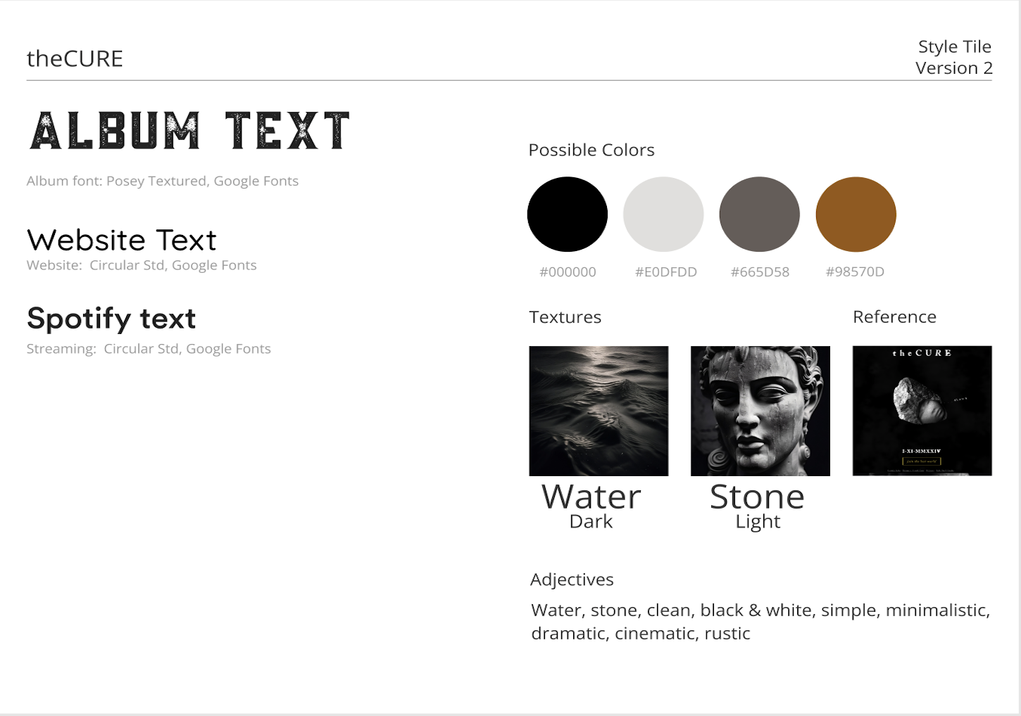
Colors
We kept it very minimalistic, simple and monochromatic in our color-spectrum:
Primary Colors:
- Black
- White
- Gray
Secondary/Accent Color
- Rustic orange
Website anatomy
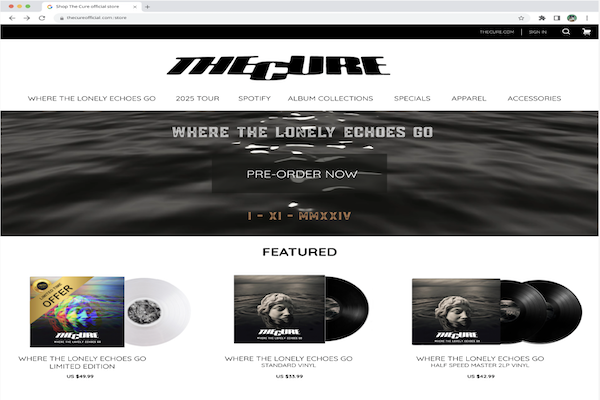
For our website landing-page, I decided to create a banner - consisting of a loop-video of dark water. The overall website is very much inspired of the The Cure's actual website for authenticity purposes.
We have kept the design simple with our primary products on the landing-page itself while we have also created merch for our new album. On our website it was also a priority to make it easy to navigate through. Our merch can easily be accessed from the landing page.
Since The Cure is a classic band, we also decided to incorporate collector's items on our landing page, for people who collects such items and for hardcore fans.
Below is the style tile we ended up using:
Click here for original assignment (In danish)
Below I have linked some of our landing pages and advertisements.
If you want to see everything, please go here
-
Sourcelist:
- Rold, M. Interfacedesign: Fra idé til digital prototype. 2. udgave. 2024
- https://www.mockupworld.co/
-
Programs used:
- Figma
- Photoshop
- Canva
- Capcut
- Adobe Firefly
- ChatGPT
