Project description:
Design your portfolio website and justify your design choices and principles based on the models and methods learned in class. Additionally, you must create a video sequence to include in your portfolio as part of the presentation.
Subject:
Designing my own portfolio
Goal:
The purpose of a portfolio is to showcase and document your professional skills, demonstrate your development, and help you reflect on what you have worked on and learned.
By Maria Breum
Intro
In my portfolio, it is essential for me to create a website that is functional, user-friendly, and rich in content—easy and straightforward for visitors to navigate. At the same time, it is equally important that my portfolio reflects who I am as a person, as well as my visual expression and aesthetic.
As I tend to be somewhat of a perfectionist—both a strength and a challenge—I knew from the outset that this would likely be a demanding task. I wanted to create something that I could feel genuinely proud of. Building the portfolio with HTML and CSS at its core, which are not my strongest skills, posed an additional challenge in bringing my exact vision to life.
Throughout the process, I have had to balance being realistic with pushing myself to achieve a result that feels satisfying and true to my ambitions.
Logo
My logo is simple, reflecting a design I always envisioned having. It symbolizes me in many ways while maintaining a classic, minimalist, and formal style.
The logo features a circle with varying spacing — one larger, one smaller — symbolizing imperfection.
Inside the circle is a simple wave, inspired by a tattoo I have on my right ribcage. The wave represents my love for the sea, but it also carries a deeper meaning for me: life itself. Life is full of waves that hit us — big and small, strong and gentle. While a wave can be powerful and relentless, one thing is always certain: it subsides; it doesn’t last forever.
This is a life motto I live by. It also draws a parallel to Karen Blixen’s story about the letter, she received that said she could open in times of either great happiness or deep despair, which bore the words: “This too shall pass.”.
Brainstorm
I began with a brainstorming session, drawing inspiration from various sources for the visual design of my portfolio.
I also created a list of elements that I wanted to include, beyond the requirements specified in the assignment. Given the project deadline, I had to carefully evaluate and prioritize between “need to have” and “nice to have” features. Additionally, I selected a series of images for color inspiration — ones that I felt conveyed a harmonious aesthetic and reflected my personal style.
To guide my process, I created a comprehensive mind map, featuring key words and concepts that I needed to keep in focus throughout the development of my portfolio.
Styletile
I created several style tiles with different color combinations, though I found it challenging to settle on a combination I was truly satisfied with. Similarly, I struggled to select fonts that felt right while adhering to the principle of using no more than two typefaces. From the beginning, I knew I wanted to maintain a simple and classic style, avoiding excessive “noise” in terms of typography and color choices. A smooth, light design instead of a heavier one.
Breakdown Structure
Regarding breakdown structures, I did not follow a specific or predefined structure.
I began by brainstorming and creating a mood board. I explored a variety of portfolio designs and saved the styles and elements that appealed to me, such as color combinations, typography, and layout concepts. All inspiration for my mood boards was gathered using Pinterest and Canva.
Next, I thoroughly reviewed the exam assignment to understand the requirements I needed to fulfill. I then researched additional elements that should be incorporated into a portfolio. To assist with creating a structure, I asked ChatGPT for guidance, and it provided many useful and actionable suggestions.
After this, I started sketching in Figma. As someone who is more visually inclined and less comfortable with traditional drawing, I prefer to create mock-ups or realistic digital sketches rather than sketching on paper. This approach allows me to better visualize the layout and assess whether the color combinations align with my vision. During this phase, I realized that my initial ideas for the portfolio design were not ideal. I worked through multiple iterations before finally settling on a foundational design that resonated with me and was achievable given my coding skills.
I worked on my portfolio every single day — seven days a week. Knowing that coding is not my strongest skill and would require additional time for me to work on, I committed myself to a rigorous schedule. My workday typically began between 8:00 and 9:00 AM, with only a short break for lunch, and ended around 5:00 or 6:00 PM. I would then take the rest of the evening off to give my mind a well-deserved break. This was the structure of my entire workflow.
You can see all of my structured work, brainstorming, mock-ups, moodboards, mindmaps etc. by pressing the Construction- button at the top or by clicking here
Principles of Design
I aimed to design my portfolio in accordance with the C.R.A.P. model:
C - Contrast:
I worked to create contrasts in various elements of my site, such as buttons when hovered over, as well as in headings and other key areas. My goal was to establish a contrast that was noticeable but not overwhelming, maintaining the calm and cohesive aesthetic of the overall design, I was going for.
R - Repetition:
I focused on creating consistency throughout the site. By establishing a clear and recognizable visual theme, I ensured that users could easily navigate and understand the purpose of each button and section. This continuity was intended to maintain a cohesive identity across all pages, enhancing usability and clarity.
A - Alignment:
I prioritized balance and uniformity throughout the design. It was important to me that the layout presented itself aesthetically pleasing on any device. Clear, straight lines and a clean, minimalist style were central to my approach, ensuring the design was visually harmonious and free of distractions.
P - Proximty:
In my design, I emphasized proximity to group related elements logically and intuitively. I ensured that elements such as headings, text, and buttons were placed close to one another when they were contextually connected. This approach helps guide the user’s attention and creates a clear visual hierarchy.
For example, I ensured that navigation menus, call-to-action buttons, and associated content were identical in design, to reduce cognitive load and make the interface easier to understand.
Additionally, I paid close attention to spacing between sections to create a sense of organization and structure, while avoiding too much clutter - especially on my Projects-sites as there are lots of text.
By maintaining consistent spacing and grouping throughout the design, I aimed to enhance both the usability and the overall aesthetic, ensuring that users can easily comprehend the relationship between different elements on the page.
Although my primary target audience will likely view my portfolio on a laptop, I made sure that the design is fully responsive across devices. However, I deliberately chose a "laptop-first" approach rather than the more conventionally recommended "mobile-first" strategy. This decision was a conscious choice based on my goals and the context of my portfolio.
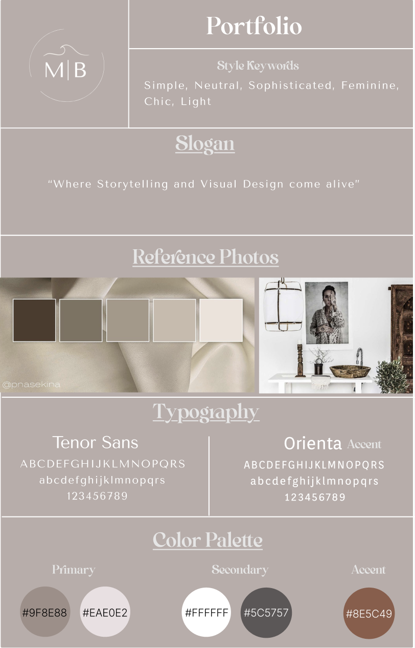
Colors
For my color palette, I opted for neutral tones and avoided using too many different colors. I wanted a light and tranquil aesthetic rather than a dark and moody one. My choices reflect my core values: nature, calmness, joy, and neutrality. It was essential for me to stay true to my stylistic preferences; neutral, sophisticated, chic, and feminine.
Primary Colors:
For the background, I chose a gradient blending of my two primary colors.
Together, these hues create a soft rose-gold tint that feels neutral and feminine — exactly the look I was aiming for.
After experimenting with various background colors, I decided on the following combination:
- Cool Beige (#9F8E88): The beige color is associated with nature, particularly the earth. It exudes a calm and comforting nuance, symbolizing and reflecting a neutral and approachable personality.
- Warm White (#EAE0E2): White serves as an excellent contrast color. By adding a subtle warmth, it became a beautifully complementary tone to blend with the cool beige, resulting in the chic and feminine shade I sought after.
Secondary Colors:
I selected my secondary colors to enhance text readability against the background gradient.
For darker areas of the background, I chose white to provide strong contrast and improve legibility.
For lighter areas of the background, I opted for dark gray, which is less harsh on the eyes compared to a stark black while maintaining sufficient contrast.
- White (#FFFFFF): White text not only complements a dark background but also adds an element of elegance.
- Dark Gray / Light Charcoal (#5C5757): This dark gray was chosen for its softer contrast against light backgrounds. Unlike pure black, which can be visually jarring, this slightly lighter tone brings a delicate and sophisticated elegance.
Accent Color:
Both brown and orange are among my favorite colors. I am particularly drawn to copper tones or the rustic charm of earthy hues. I felt that a warm, brownish-orange color would provide a striking contrast while harmonizing beautifully with the other tones in my palette.
- Brownish Orange (#8E5C49): Orange radiates energy and warmth. It is an intense, eye-catching color that feels approachable and inviting. This hue, reminiscent of vibrant sunsets, evokes joy and vitality. It also serves as a stimulating and activating accent color, making it ideal for interactive elements like buttons.
The brown undertone in this orange shade tempers its intensity, grounding it with an earthy warmth. This blend strikes a balance between vibrancy and sophistication, making it a perfect accent for the overall design.
Conclusion
Overall, I am satisfied with the outcome of my portfolio. I believe I have successfully created a portfolio that reflects who I am as a person and highlights what I can offer.
Given my limited knowledge of HTML and CSS, I have managed to produce a final result that exceeded my own expectations.
My portfolio includes the projects I have completed during my studies, along with detailed documentation and links to construction pages and final results. Additionally, I have incorporated my personal projects and designs, as well as introduced my future dream — Digital Dreamscapes.
I aimed to make the website as authentic as possible while meeting the exam requirements.
Throughout this process, I have learned a great deal. I have made numerous mistakes, had to revise significant portions of the work, and even deleted entire pages to start over. This journey has been challenging but invaluable for my development.
-
Sourcelist:
- Rold, M. Interfacedesign: Fra idé til digital prototype. 2. udgave. 2024
- Caldas, S Palette Perfect - for Graphic Designers & Illustrators: Color Combinations, Meanings and Cultural References.
- W3-Schools
- Youtube
-
Programs used:
- Visual Studio Code
- Figma
- Canva
- Capcut
- ChatGPT
- Suno